PS Piece
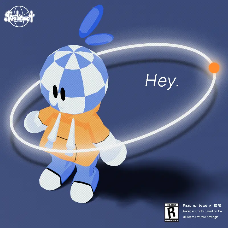
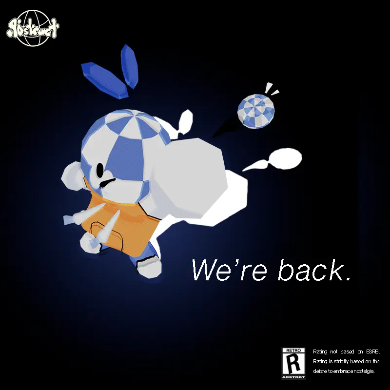
The character Checkers, retrofied!
In this project, the main goal was to capture the
old feeling and sentiment of the video games people
enjoyed generations ago!
The inspiration came straight from the fourth generation, so making the model blocky was
a necessity.
The models of the time also didn't have as much detail. To compromise,
popular retro games focused more on style and aesthetics.
Because of that, Checker's model consists of flat colors, almost
mimicking a cel-shaded look; I often thought of "Jet Set Radio's" art
design and how successful their designs were while also texturing their
models with basic png. files.
My main intention was to make the character model for Checkers to be as close to the original
design as possible, while also attempting to make them on the small and cute side. It turned out how
I hoped. This was the first crucial step going into this project. I wanted more work that had Checkers on it, so people can feel more connected with the character, making them closer to the brand,
ABSTRACT.


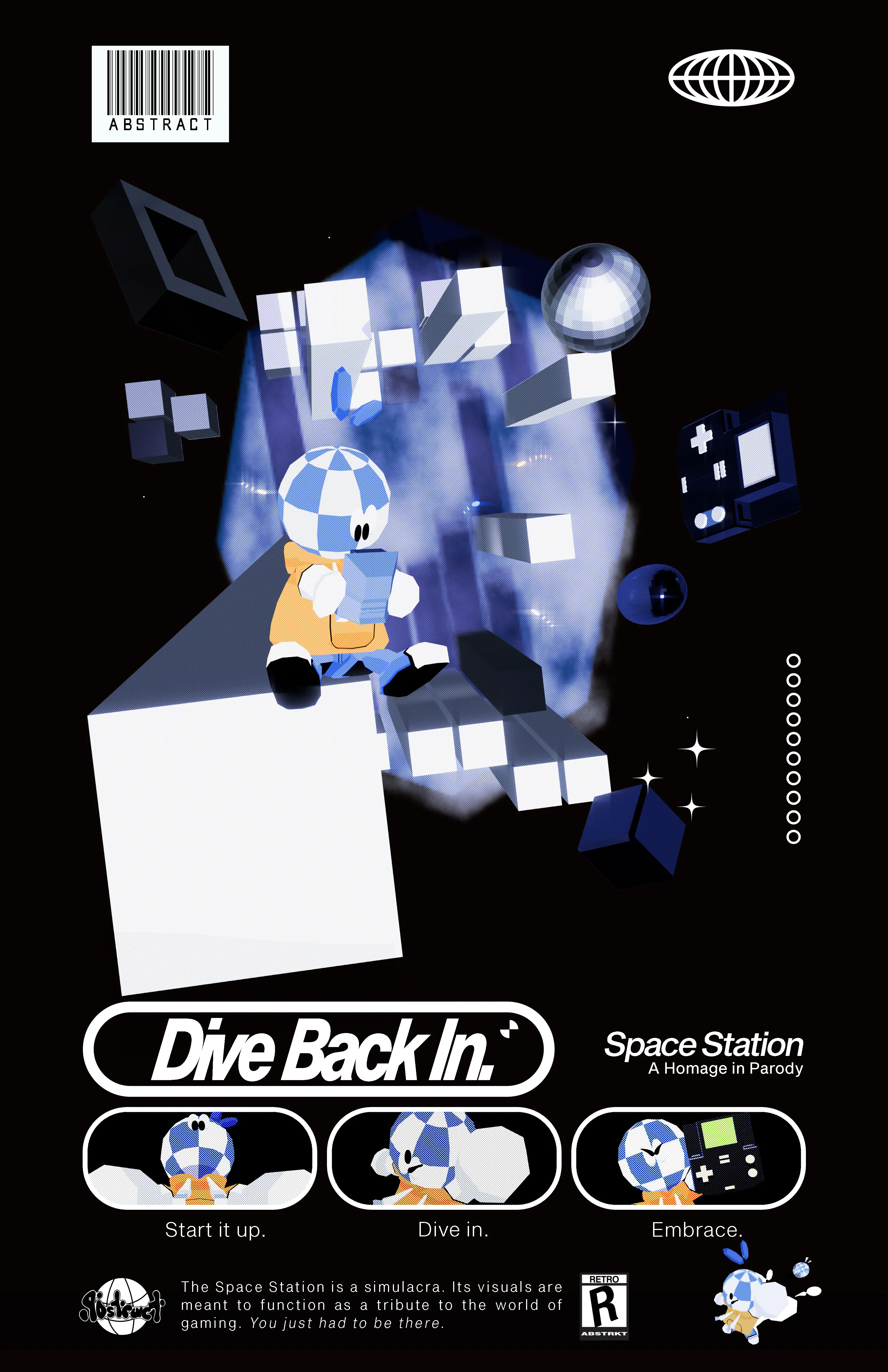
A Homage In Parody; ABSTRACT's callback to the greats into a poster.
It's very clear where the inspiration came from. In this project, the main purpose was to show the passion;
by giving a homage to the greats, it's a perfect way of representing the brand and what we stand for. To make it truly
captivate that old feeling, the poster's type layout, imagery, and message breathes air that came straight from the time between
1995-2008.
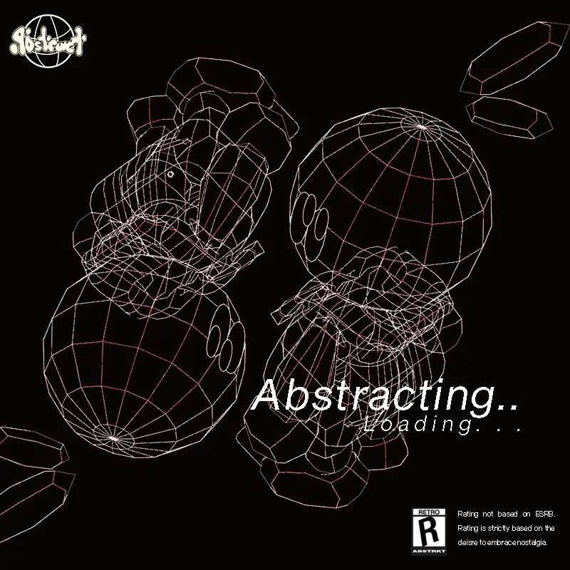
Since Checkers' model was rigged, this also felt like a good way of publically introducing Checkers. You might have already noticed that Checkers
appears to be the main focus of the poster. The time spent making the model for Checkers was much longer than building out the scene because Checkers had
to look perfect.
Back on the talk of nostalgia, this design was originally made to be a shirt, since the brand is about clothing. However, the design felt less fitting
for something to wear and more of something to put up for display. It's fortunate to come to that conclusion, because the design mimics the look of an old magazine.
Designer
Space Station Context
Oh, that's me!
My name is Jason Johnson. I'm a graphic designer who's exploring the world of UI/UX and Web Design.
I'm currently enrolled into Virginia Commonwealth University School of the Arts.
While I'm enrolled, I've pursued
an ongoing project called ABSTRACT. The project feels like an outlet to express myself and my interests and share it with others.
I'm very grateful that I've had the support to continue to push this project/brand throughout my school life. It's kept me busy and keep me
focused.
With this project, I used Figma to lay out the user interface of the website, then I coded it all out with HTML/CSS and Javascript on Visual Code Studio.
The Space Station was based off of a previous project that debuted my freshman year.
The "Space Boy", the original project, was a physical replica of what I imagined to be an innovative hadnheld console.
While the final outcome of the original project received positive feedback, it didn't satisfy me. Despite being a crafted
console, the project wasn't interactive enough. That was my thought process going into the next iteration of the Space Boy: "The Space Station": a
complete upgrade.
Building on the lessons learned and experiences gained from that initial project, I sought to expand its scope and ambition,
ultimately transforming the concept into something more advanced and comprehensive. Now, the project is not only in a digital forum, but it greatly
surpasses its predecessor. It's a polished and carefully thought out website that brings its point across via HTML/CSS and JavaScript.